Navigating in Web-Based AASHTOWare Project
Web-based AASHTOWare Project components and webpages include a variety of features to help you navigate more easily through the system. The features described in this topic are standard throughout the system.
-
Note: To protect the information contained in your agency's system, navigation features provide access to only those components for which your active role has been assigned access rights. For more information, see Understanding Your Role and Using Components.
The Dashboard
When you log on to the system, the software opens on the dashboard. You can also go to the dashboard at any time by clicking the Home button on the Menu Bar.
The dashboard contains one or more components. Each component is identified by a title set within a blue header bar. Each component provides access to the information and processes required for a specific area of your agency's work. The components you see on your dashboard are those that match the specific areas of responsibility assigned to your active role. See Understanding Your Role and Using Components for more information.
The following example shows the dashboard as it might appear for a system administrator. Keep in mind that some of the components shown in the example might not be available for you depending on your active role and which business areas are included on your system.
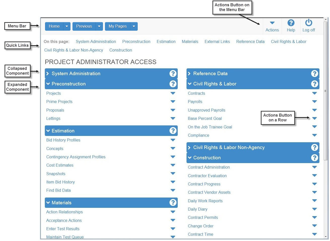
The dashboard includes these standard features:
-
Menu Bar — The system displays the Menu Bar at the top of every webpage in the system. The buttons and menus on this bar help you to move quickly through the system to visit the pages and components you use most often.
Your agency may choose to also display these features on your dashboard:
-
Home Page News — This component provides important information from your agency.
-
External Links — This component provides links to websites you use outside of the AASHTOWare Project application.
Menu Bar
The Menu Bar is a horizontal strip at the top of every application webpage.

The left side of the Menu Bar contains these buttons and menus:
-
Home - Clicking this button takes you to the dashboard for your active role. Clicking the down arrow opens the Home menu, which contains an indicator for your active role (bold text with a check mark) and lists all the roles assigned to you. This menu allows you to switch roles from any location in the system. When you switch roles, you remain on the component where you were working unless the new role does not have appropriate security rights, in which case the system takes you to the dashboard. For more information about roles, see Understanding Your Role.
-
Previous - Clicking this button returns you to the last page you visited in the system using your active role. Clicking the down arrow displays a list of links to the most recent pages you visited in your active role, along with a link to the Previous Activity Overview component. On the Previous Activity Overview, you can access a much longer list of links to previously viewed pages. Clicking a link takes you to that location in the system.
-
My Pages - Clicking this button takes you to the My Page Overview component, where you can manage frequently used (or favorite) pages for your active role. You can add pages as favorites from any location in the system by clicking the down arrow and selecting Remember this Page.
The right side of the Menu Bar contains these buttons and menus:
-
Actions - Clicking this button opens a menu of actions you can take within the system. The actions that are listed are limited to those that are relevant for your active role. When you select an action, the system automatically takes you to the component in the system where the action can be performed.
-
Help - If your agency has recorded agency Help, clicking this button takes you to a separate browser window containing online help for your active role. If agency Help has not been recorded, clicking this button takes you to the Welcome page of the standard online Help.
-
Log off - Clicking this button ends your session (see Logging Off).
Quick Links
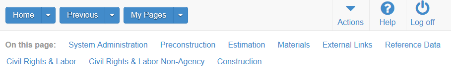
If you are on a page that contains multiple components, quick links preceded by the label On this page are displayed for each component on the page. When you click one of these quick links, the system automatically scrolls the page to the location of the component.
Hypertext Links
Hypertext links can be located anywhere on an application component, including a field value, and are identified by blue text. When clicked, a link takes you to another component or page, usually one containing more detailed information than what is available in the current component. After you have clicked a link, it changes from blue to purple to remind you that you have already visited that link.
-
Note: In a list, when you add a new row in which one of the field values is a hypertext link, the link is disabled until you save the new record.
Alternate Paths
Keep in mind that all of the various navigational elements, such as hypertext links, quick links, recent pages, and Actions menus, can all provide different ways of accomplishing the same task. The same command might be accessible from an Actions menu or as a link. For example, to access the Project Overview component, you can click the Projects link on the Preconstruction component, or you can select Open from the Actions menu on the Projects row. Both methods of navigation achieve the same result. Feel free to explore the system and find the ways of navigation that are best for you.
Using Bookmarks
You can bookmark specific pages in the software just as you would for any other website. However, if you have not yet logged on to the system, clicking a bookmark will take you to the logon page rather than the bookmarked page.
Icons
Icons are small images throughout the system that either convey information or can be clicked to perform an action. For example, a red asterisk icon indicates a required field. An eraser icon in a Quick Find search box can be clicked to reset search criteria. This table shows some of the common icons used in the system:
|
Icon |
Usage |
|
|
The eraser icon appears in Quick Find search boxes after criteria is entered. You can click the icon to reset the search criteria |
|
|
This magnifying glass icon at the left side of a field indicates an auto-complete field. Auto-complete fields display a filtered list of field values based on the first few characters you type. You can press Enter to show all values. |
|
|
This magnifying glass is sometimes displayed on the right side of a text box. Clicking this button opens a text dialog panel that allows you to view and edit the text in a larger area. |
|
|
A red asterisk indicates a field where data entry is required. |
|
|
The actions icon appears on Actions buttons that you can click to display an Actions menu. Actions menus provide access to commands and functions you can perform on data. |
|
|
The red X icon appears on Delete buttons that you can click to remove newly added rows that have not been saved. Clicking a Delete button removes the row immediately. |
|
|
The trash can icon appears on the Mark for Deletion button that you can click to remove saved rows. When you click the Mark for Deletion button, the button changes to an Undo button. The row is removed only when you save the changes. |
|
|
The undo icon appears on Undo buttons that you can click to reverse an action, such as deleting a saved row. |
|
|
The help icon appears on Help buttons that you can click to display the online Help system. |
|
|
The calendar icon is displayed on the right side of a date field. You can click the calendar icon to display a calendar where you can pick a date as the field value. |


-
Note: For questions about using your browser's navigation features, such as the Back button, and the Tab and Arrow keys on your keyboard, see the FAQ page.